Lisa Congdon x Dovetail Workwear

I am so excited to announce that I’m working with one of my favorite woman-owned companies as a brand ambassador & pattern designer! Dovetail Workwear is based in Portland, OR, and design & sell super durable, gorgeous workwear made for the bodies of women & nonbinary folks. Any of you out there who work outside or with machinery, tools or paint? This stuff is especially for you, but it’s awesome for EVERYONE. Shop their line of workwear and accessories, including my new bandana with discount code LISACONGDON for $10 of your order!
Shop Now
Lisa Congdon on Creativebug!

Did you know Lisa has 14 (!!!) art-making classes on Creativebug? From 30-day drawing challenges to how to approach keeping a sketchbook (and keeping it fun) to a handful of brief project-based classes, you can find all of the options here. Take them at your leisure, post and your work on the platform (this is optional), and use Lisa's prompts, tricks and tips to continually grow as a creative. Curious about the classes? Each class has a video trailer and an in depth description of activities and materials. See you in class!
Explore Classes on Creativebug
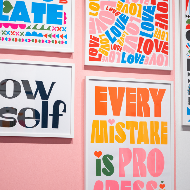
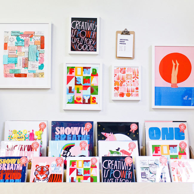
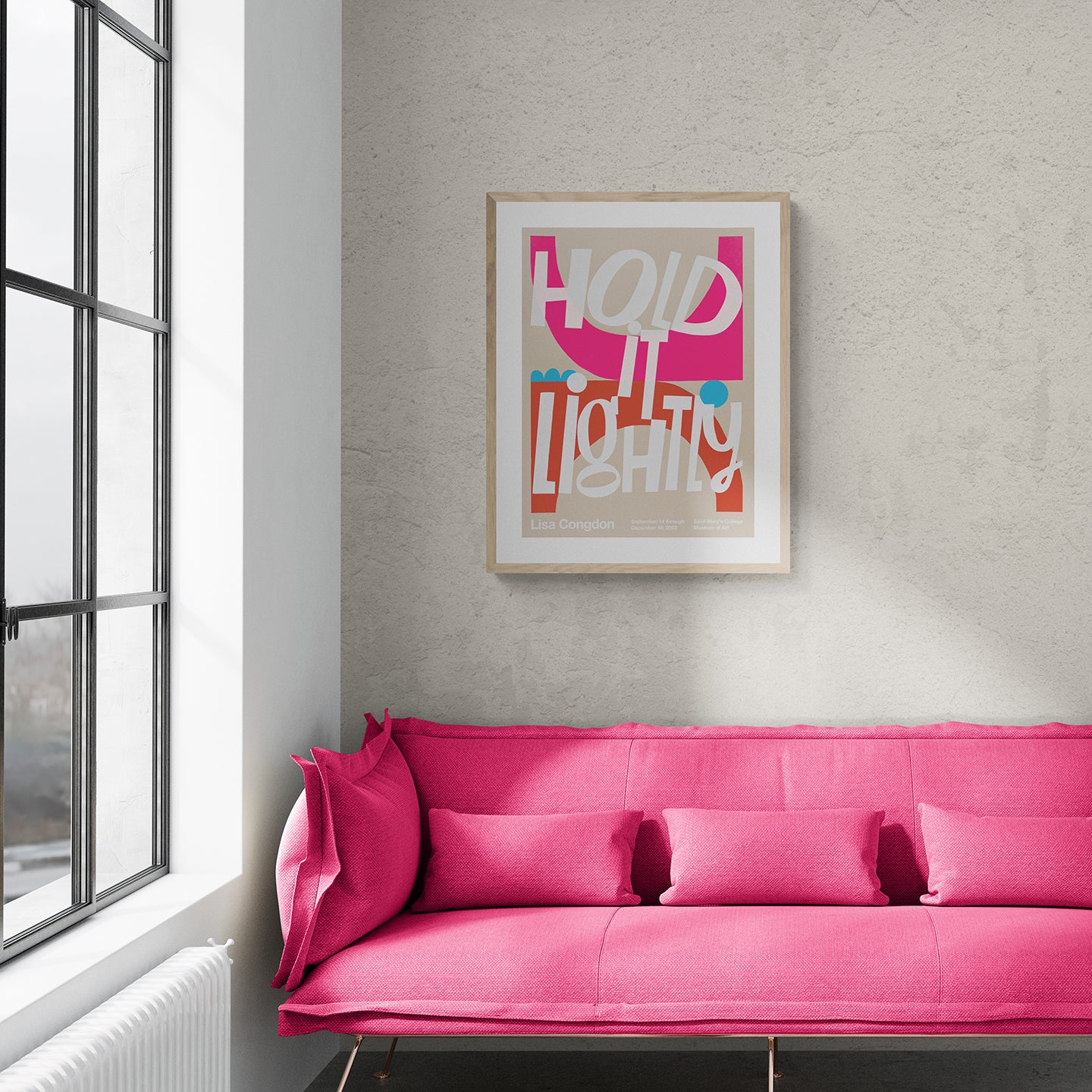
See "Hold It Lightly" through June!

As many of you know, my museum show, Hold it Lightly, has been extended through June of 2024, so there are tons more opportunities to see it! Hold it Lightly is on view Wednesday to Sunday — 10am to 4pm
Learn more about the show here.
Interested in purchasing work from the show? You can view and purchase right here on our website!